Visualize metadata
This notebook shows a few examples of how to use the poligrain functions to visualize CML meta data.
To add: plotting SML & PWS meta data
All the functions rely on the OpenSense naming convention so that we can easily pass an xarray.Dataset or DataArray to the functions.
[1]:
import matplotlib.pyplot as plt
import xarray as xr

import poligrain as plg
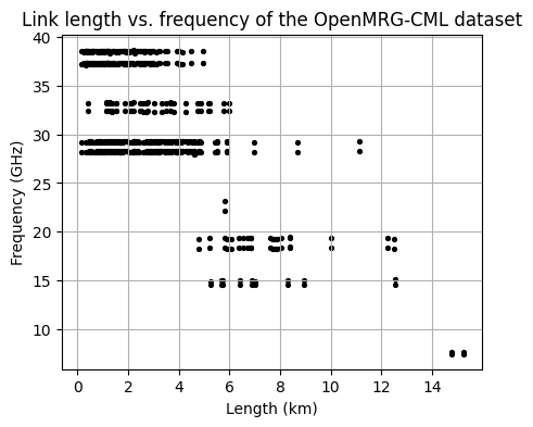
Plotting length vs. frequency
Plot the distribution of frequency against the corresponding length for the entire CML dataset.
[2]:
# Load example dataset
ds_cmls = xr.open_dataset("../../tests/test_data/openMRG_CML_180minutes.nc")
[3]:
fig, ax = plt.subplots(figsize=(5, 4))
scatter = plg.plot_metadata.plot_len_vs_freq(
    ds_cmls.length, ds_cmls.frequency, marker_size=30, grid=True, ax=ax
)

# optionally customize output plot
ax.set_title("Link length vs. frequency of the OpenMRG-CML dataset")
[3]:
Text(0.5, 1.0, 'Link length vs. frequency of the OpenMRG-CML dataset')
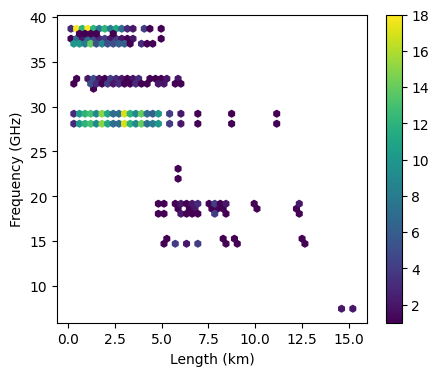
Frequency vs. length hexbin
Alternatively, plot the same as above but as a scatter density plot
[9]:
fig, ax = plt.subplots(figsize=(5, 4))
hexbin = plg.plot_metadata.plot_len_vs_freq_hexbin(
    ds_cmls.length, ds_cmls.frequency, gridsize=50, ax=ax
)

plt.colorbar(hexbin, label="density")
[9]:
<matplotlib.colorbar.Colorbar at 0x23349d2ac80>
[WIP] Frequency vs. length with margin plots
Plotting distributions of frequency, length, and polarization.
[WIP] Possibly add orientation too.
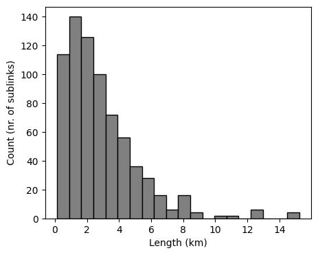
[10]:
fig, ax = plt.subplots(figsize=(5, 4))
len_bars = plg.plot_metadata.plot_distribution(
    length=ds_cmls.length, frequency=ds_cmls.frequency, variable="length", ax=ax
)
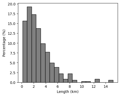
We can also plot the distribution as a percentage.
[11]:
fig, ax = plt.subplots(figsize=(5, 4))
len_bars = plg.plot_metadata.plot_distribution(
    length=ds_cmls.length,
    frequency=ds_cmls.frequency,
    variable="length",
    percentage=True,
    ax=ax,
)
And customize the plot a bit using keyword arguments.
[13]:
fig, ax = plt.subplots(figsize=(5, 4))
len_bars = plg.plot_metadata.plot_distribution(
    length=ds_cmls.length,
    frequency=ds_cmls.frequency,
    variable="length",
    percentage=True,
    ax=ax,
    rwidth=0.5,
)

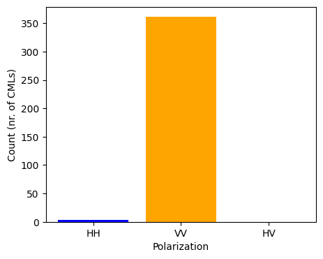
We can also plot the polarization of CMLs. In this dataset all CMLs have two sub-links, both with the same polarization, of which the vast majority is vertically polarized.
[15]:
fig, ax = plt.subplots(figsize=(5, 4))
pol_bar = plg.plot_metadata.plot_polarization(
    ds_cmls.polarization, colors=["blue", "orange", "green"], ax=ax
)
[WIP] Plot availability during data period
[ ]:
[ ]: